Re:Build
Re:Build is a company that takes important products from concept to full-rate production through integrated design, engineering, and scalable manufacturing. As a Graphic Designer on their design team, I created branded assets, layouts, templates, and client-facing graphics. I designed a variety of print and digital assets including web icons, social media templates, white paper layouts, packaging and web design assets, supporting digital campaigns and client-facing marketing materials.
Safety Brochure
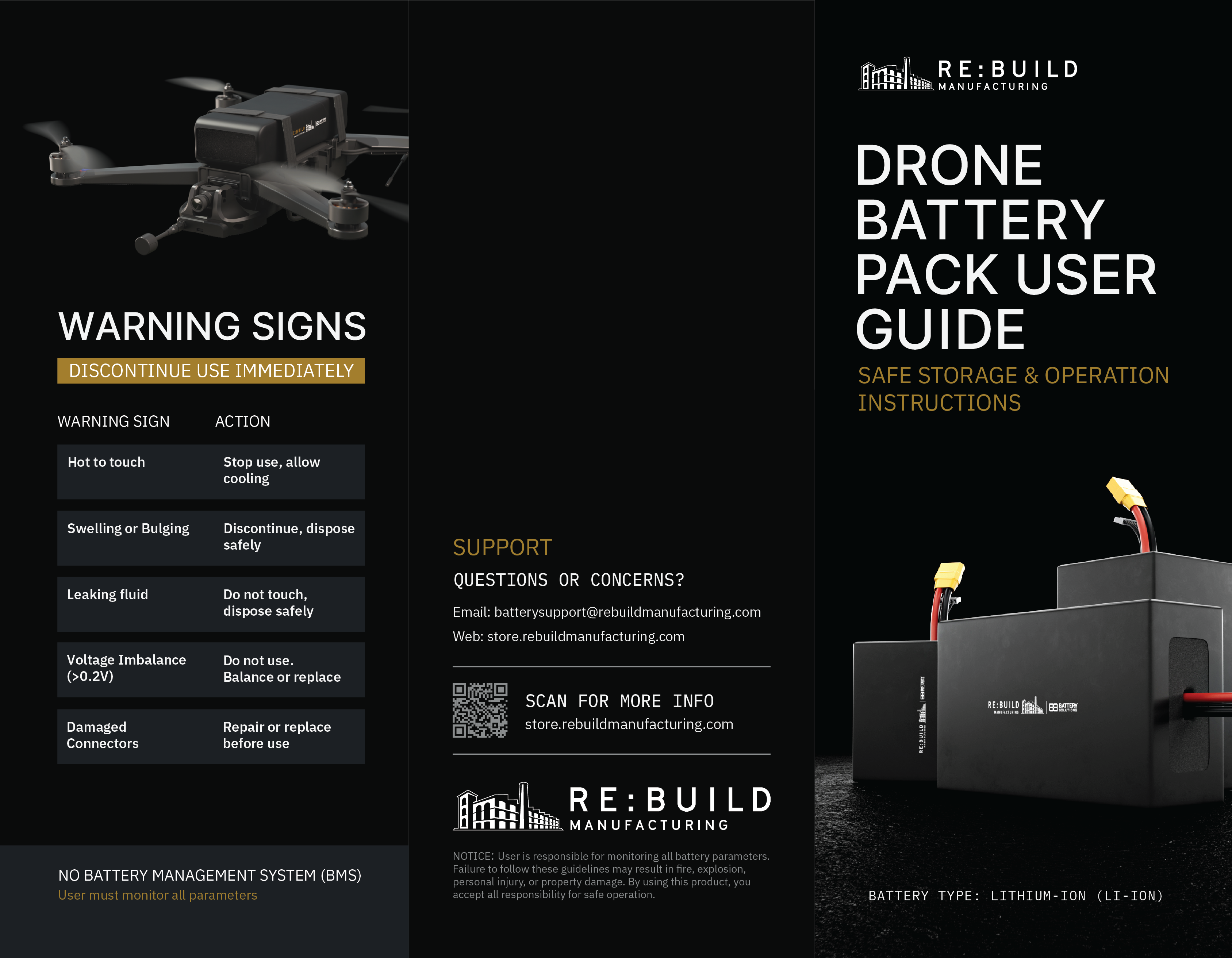
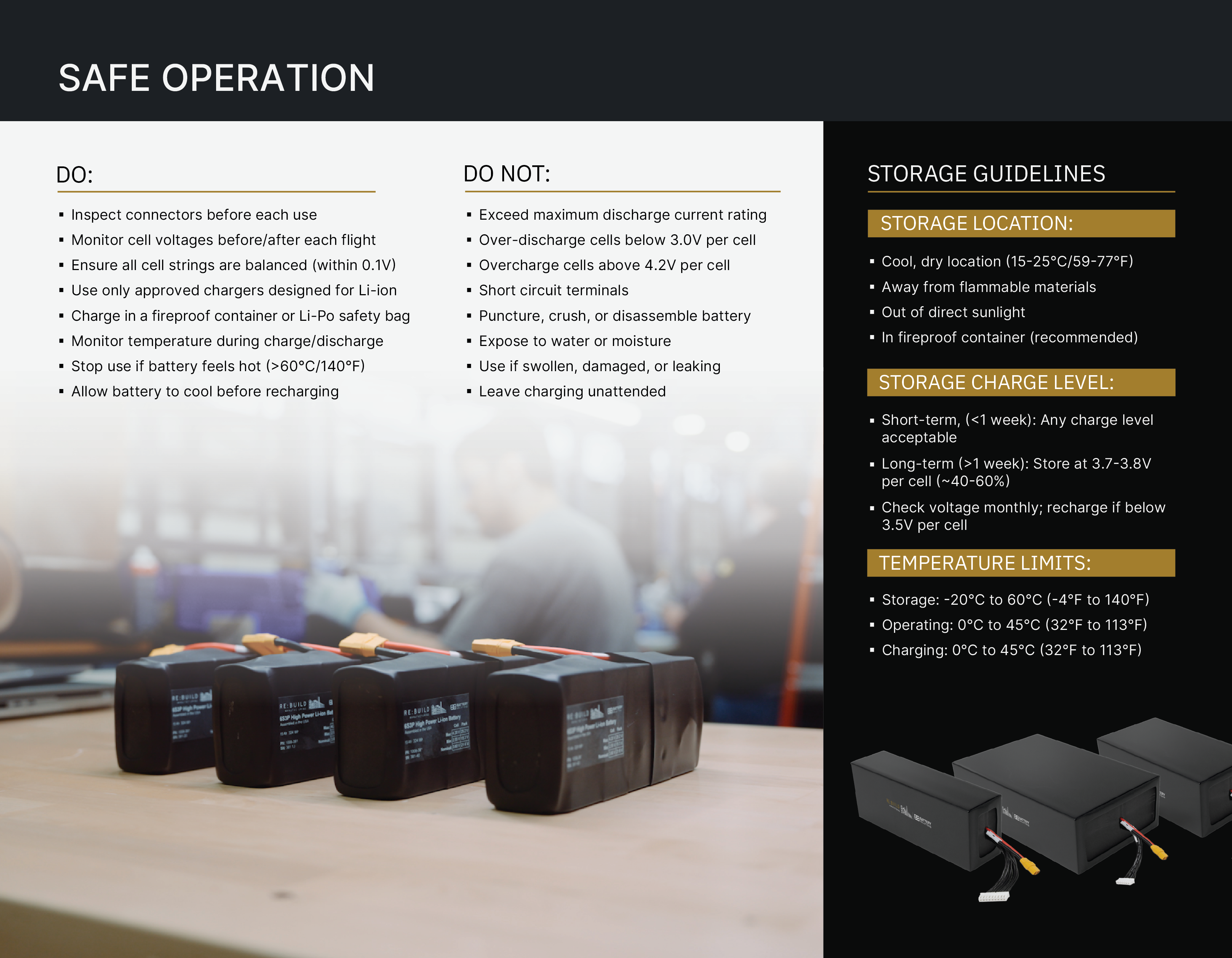
One product was a drone battery that required a Safety User Guide. This trifold contained lots of important information so it was essential that it read clearly. I also had to adhere to the company's brand including colors and typography. It was printed and included with the battery orders.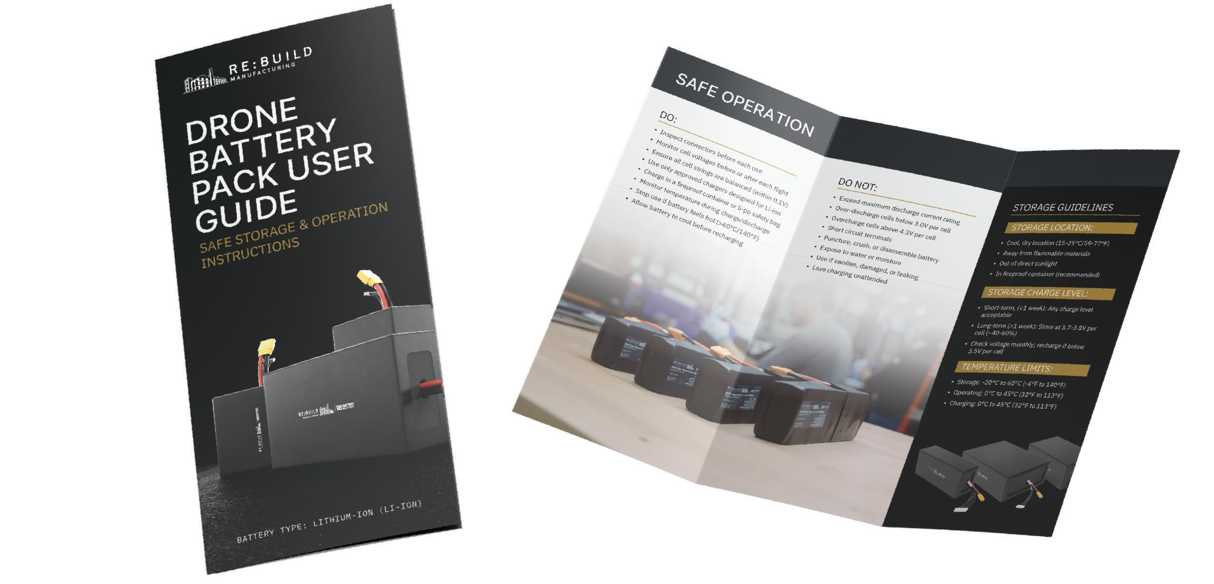
Welcome Box
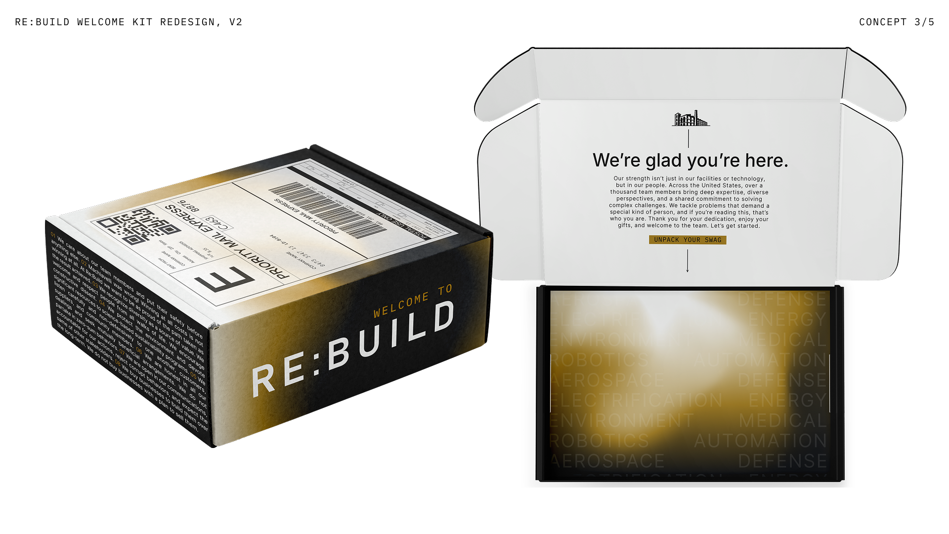
To welcome new employees into the Re:Build Manufacturing family, I designed a physical welcome box that introduces the brand's identity and values from the very first day. The box translates Re:Build's industrial, precision-driven visual language rooted in American manufacturing, into a tactile, unboxing experience that reflects the company's mission to rebuild American industry from the ground up.Gold Gradient Option
The box's side panel is printed with Re:Build's core principles, set in small dense type that rewards a closer read, grounding the box in the company's culture before the recipient even lifts the lid. A soft gold-to-black gradient washes across the exterior and reappears on the interior tray, softening the industrial look and giving the unboxing moment a warmth that feels more like a welcome than a shipment. Inside, the markets that Re:Build serves: Aerospace, Defense, Energy, Robotics, Automation, and more are repeated as a faint, layered texture across the bottom tray, turning a list of capabilities into a subtle pattern rather than a dry directory. Together, the dark exterior and light, glowing interior create a deliberate experience.
Dark Textured Option
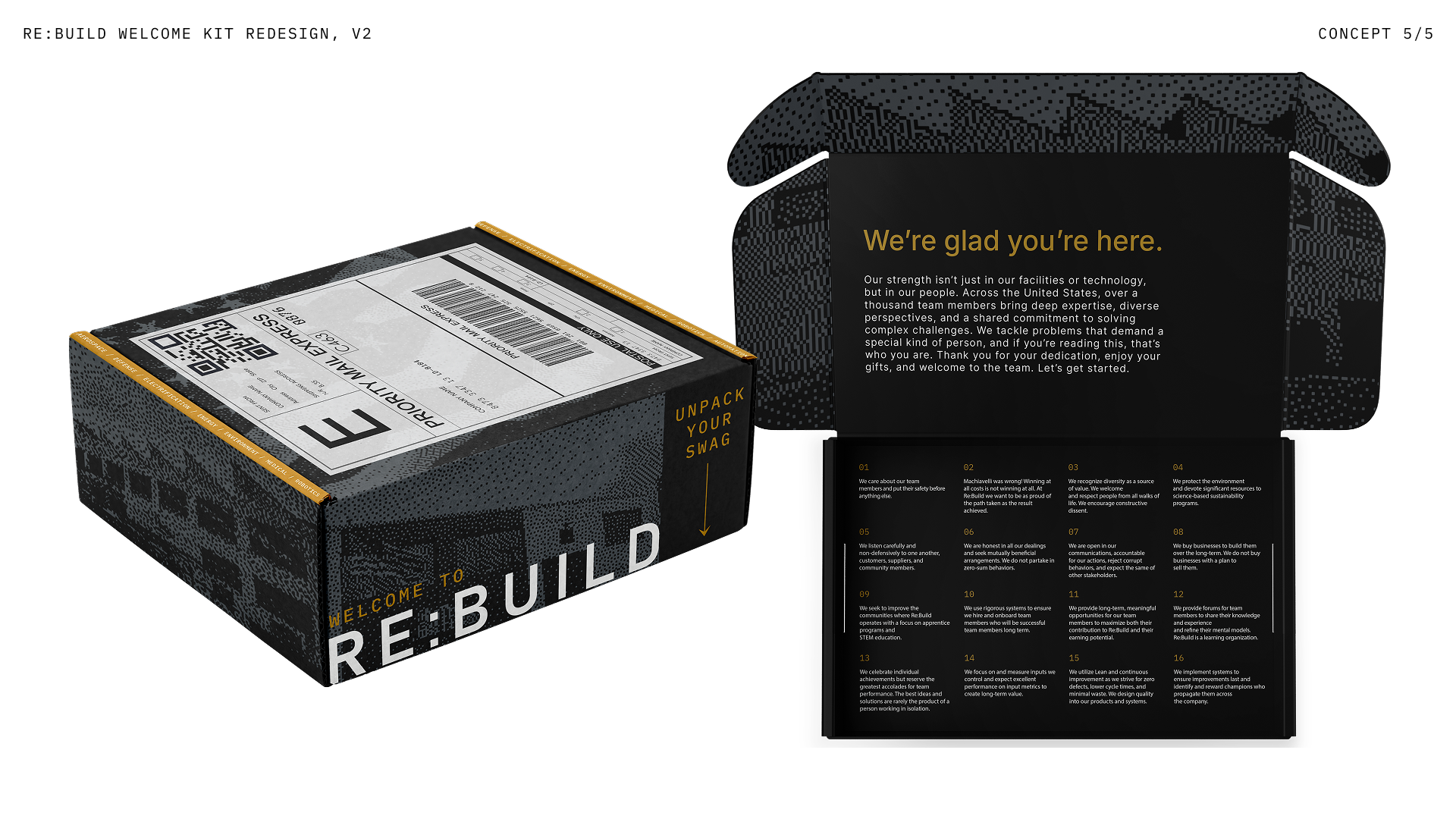
This concept takes a more monochrome, all-over approach, wrapping the entire box in a dense pixelated texture built from the New Kensington building icon. The company's market sectors are repeated in a gold band on top. The commitment to dark grays and black carries through to the interior as well, where the welcome message and the company's full sixteen principles are laid out in gold text on black rather than black on white.
Interior Photography Option
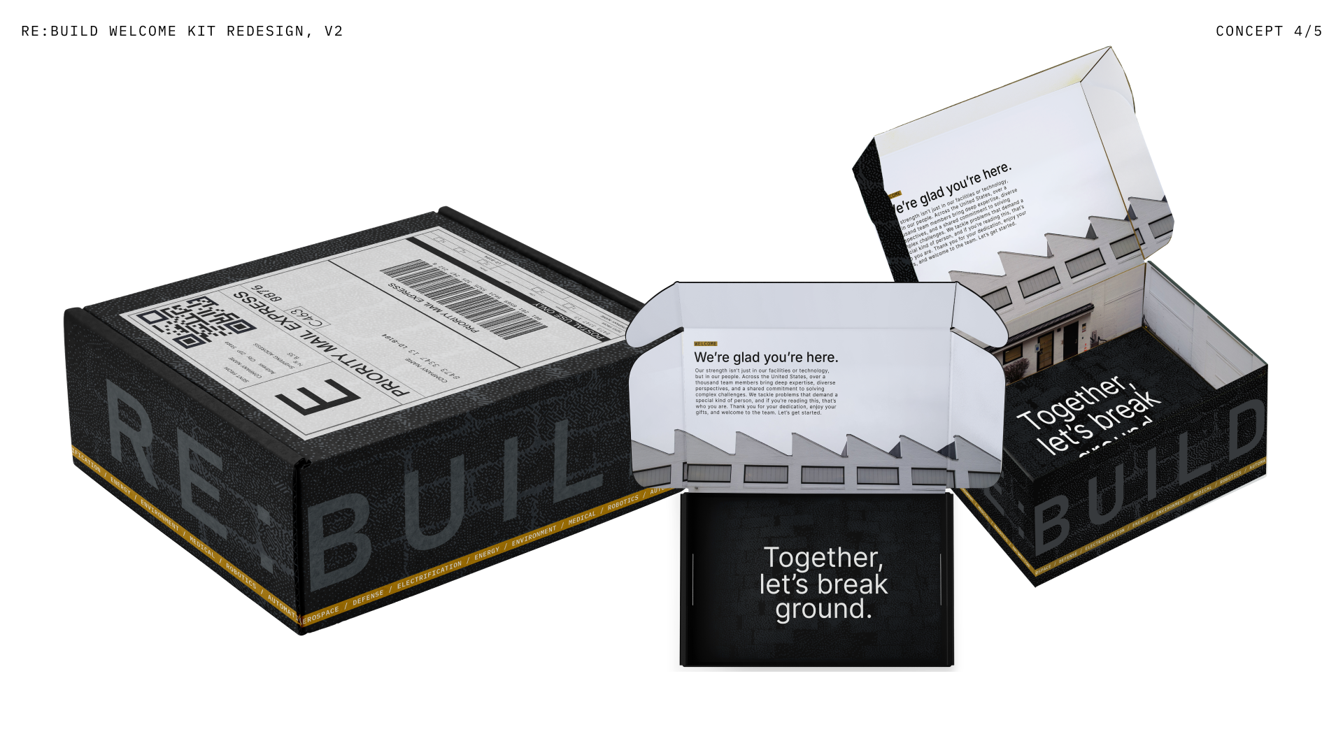
This concept builds the New Kensington building directly into the unboxing sequence itself, rather than treating it as a standalone icon. As the box opens, the interior flaps unfold into an actual photographic elevation of the building's rooftop and sawtooth window line. That exterior is an image of the site's brick walls with the same dense texture applied to it. Closing the loop, the bottom interior panel introduces a new line, "Together, let's break ground," set in white on dark textured ground — picturing the literal image of broken ground. On the exterior, an oversized, ghosted "RE:BUILD" wordmark subtly lifts from the black texture, reinforcing the sophisticated, understated quality of the dark palette while still leaving the gold sector stripe as the one clear moment of color and hierarchy.
Social Templates
I created a large variety of posts that announced new hires, provided an image for new employees to post to their personal accounts, shared open positions, company anniversaries, and more.
When creating these, the company was rebranding so much of the standards were not established. With all the moving pieces, it was important that each post was aligned with the direction that the brand was taking.
Hiring Templates
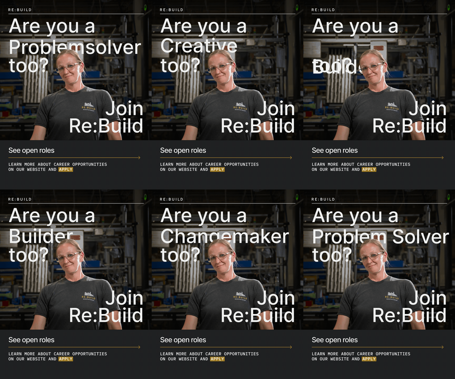
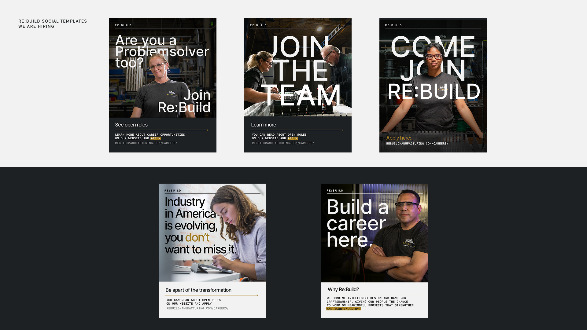
Re:Build needed graphics for recruitment purposes. These had to be eye-catching and inspiring. To accomplish that, I used these hero-style photos and masked bold headers. The images felt deeply personal yet stirring enough to grab viewers' attention.
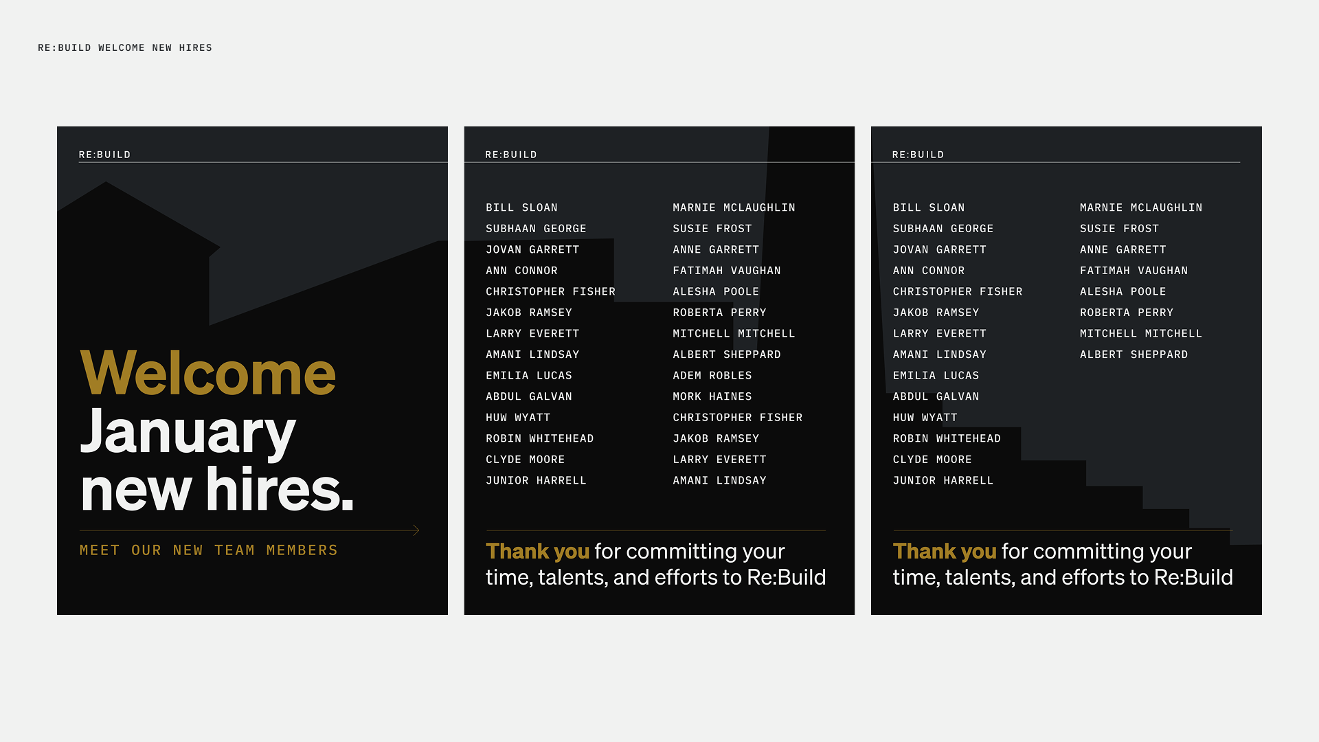
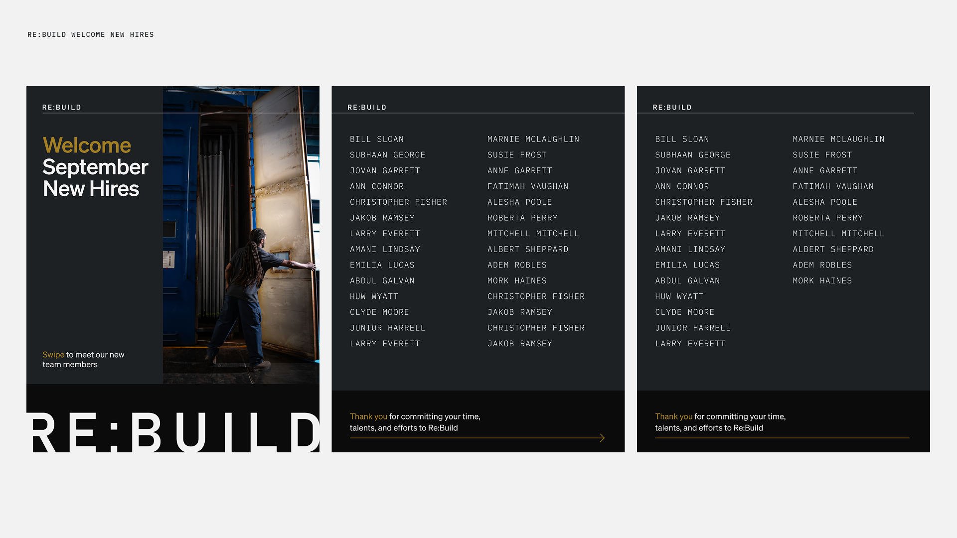
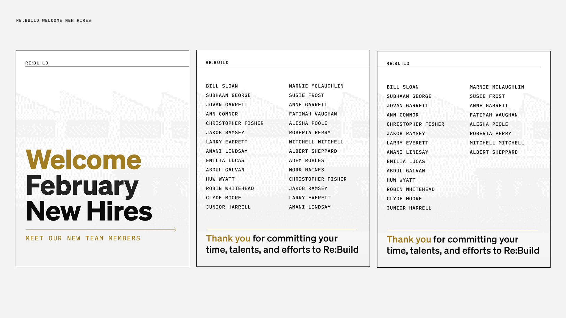
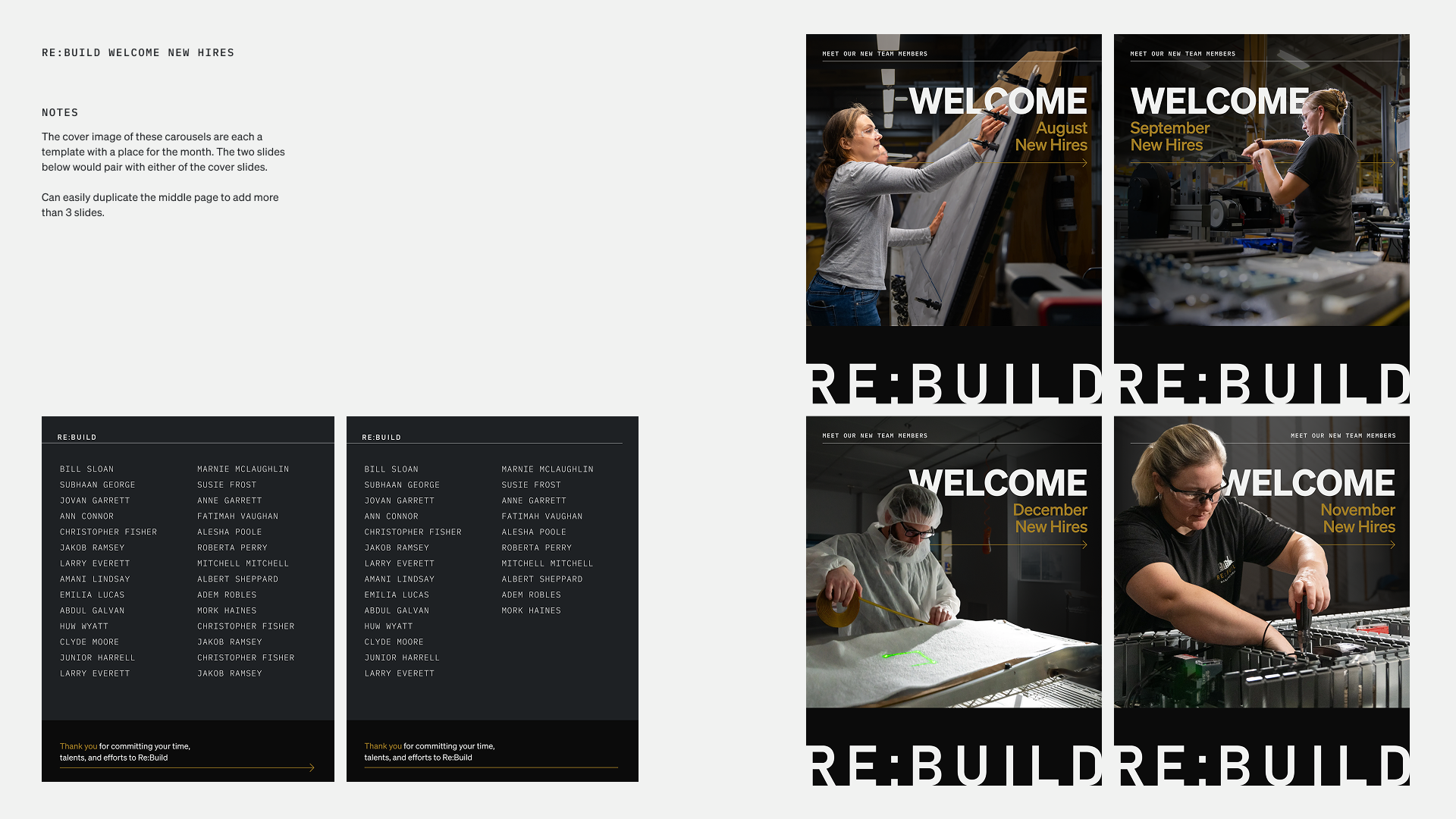
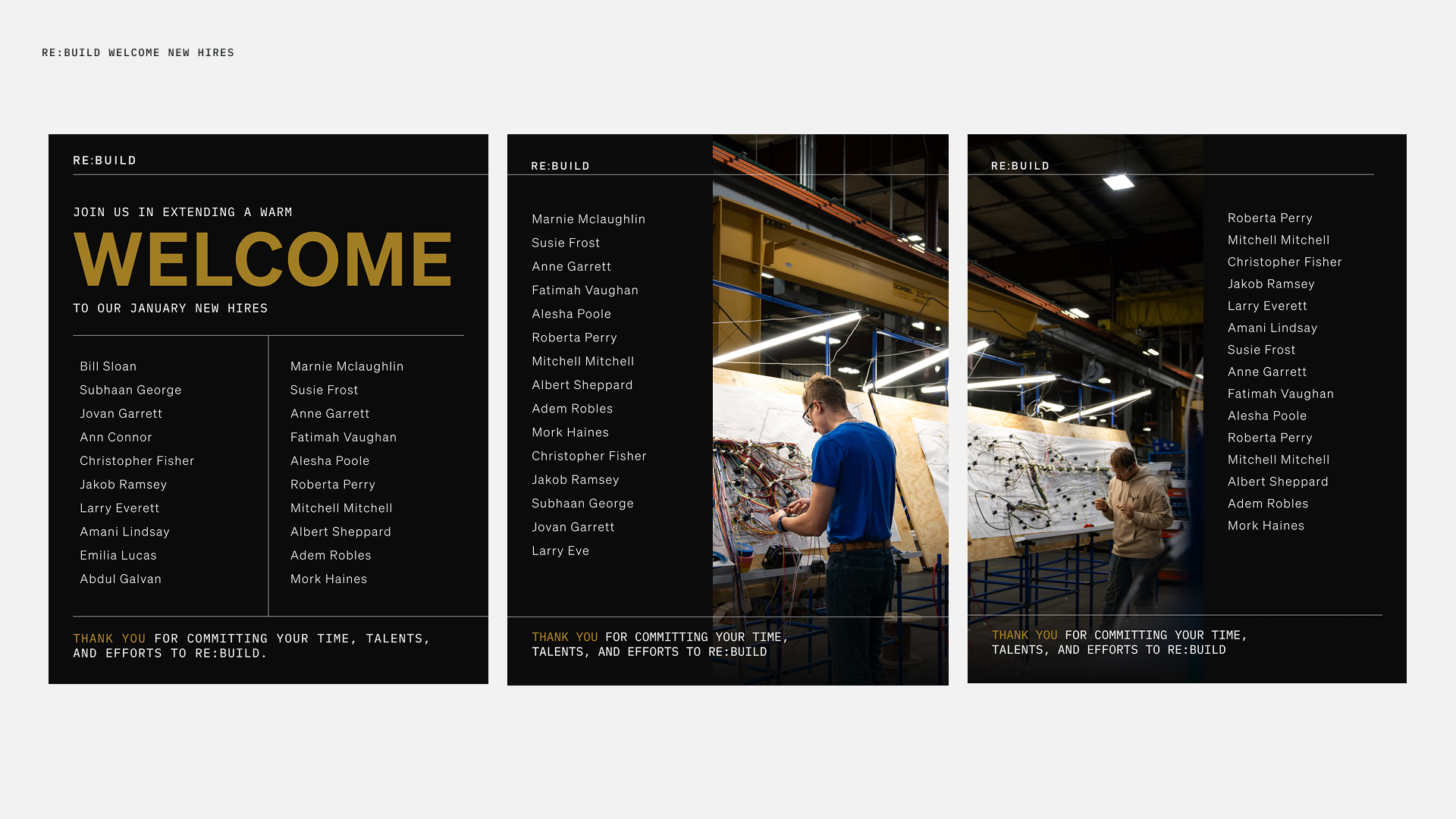
Welcome New Hires
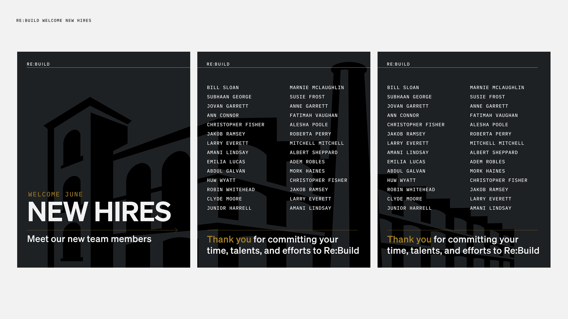
Re:Build is an expansive company so they hire for many different positions. It was important that the graphics were adaptable enough to consider all positions. Often, Re:Build posts once a month with a long list of new employees so I made sure that each template was seamless to allow as many slides to be added/deleted.
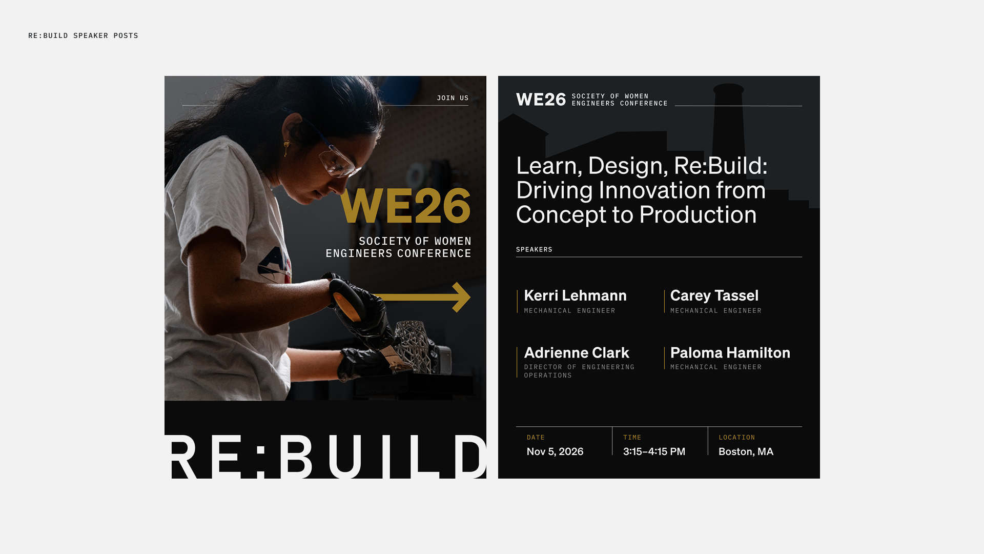
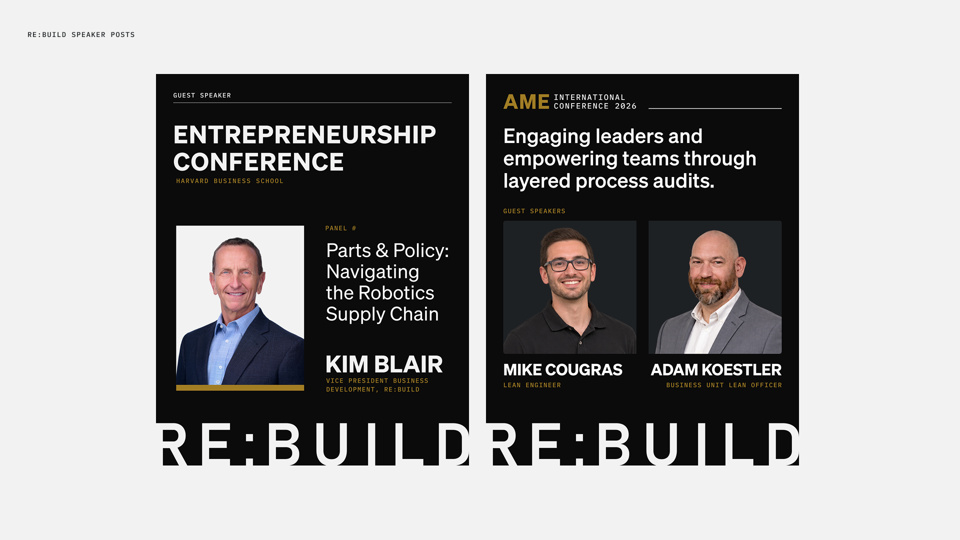
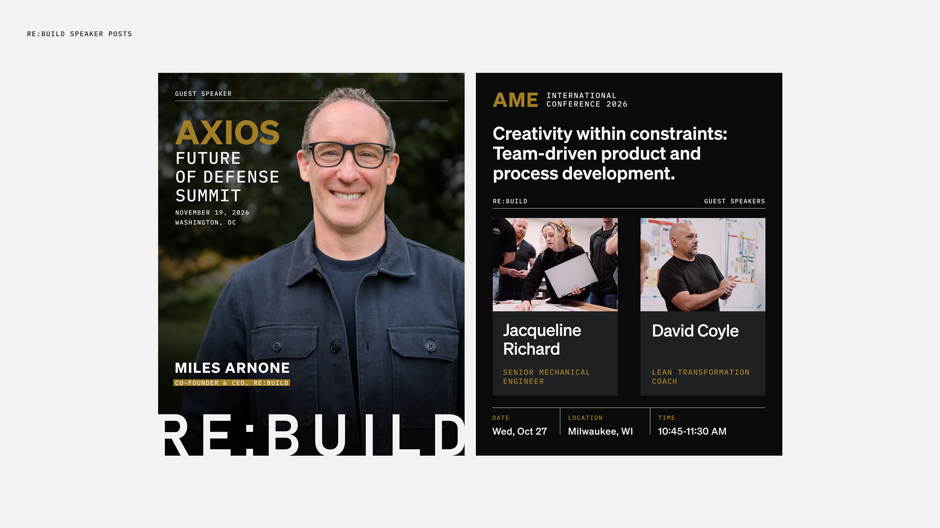
Speaker Event Posts
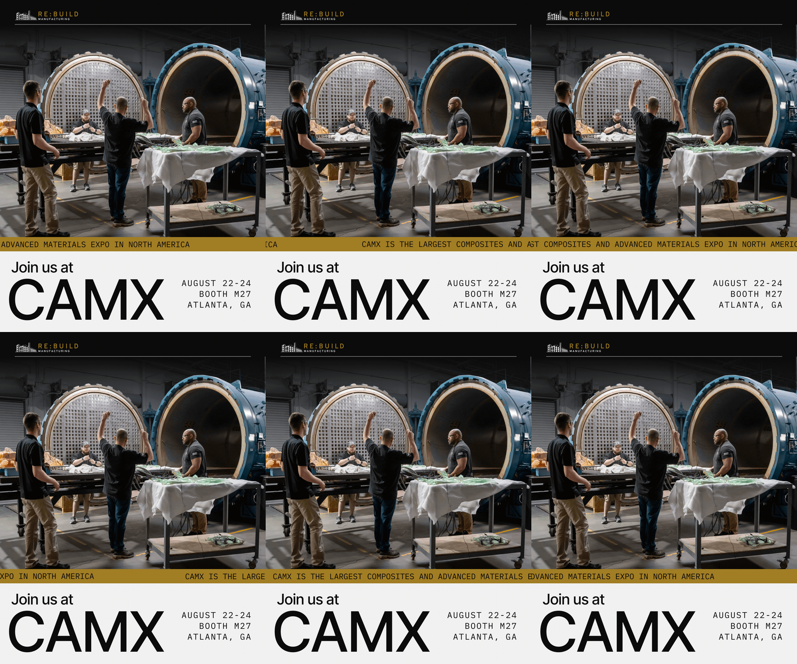
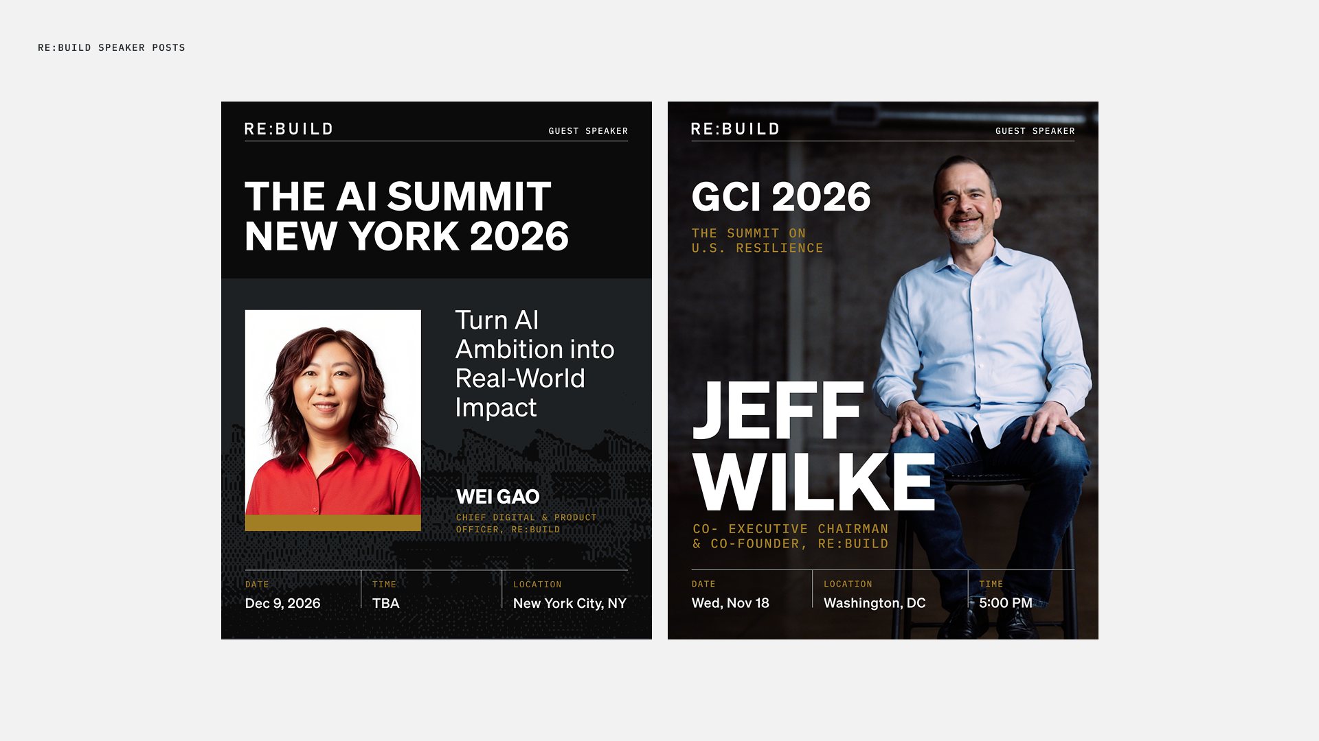
These social media graphics are meant to be posted on LinkedIn to promote Re:Build speakers who are talking at events and conferences. In some cases, it was important to emphasize who was speaking, in other cases it was important to provide the speaker topic or conference name.
I've Joined Posts
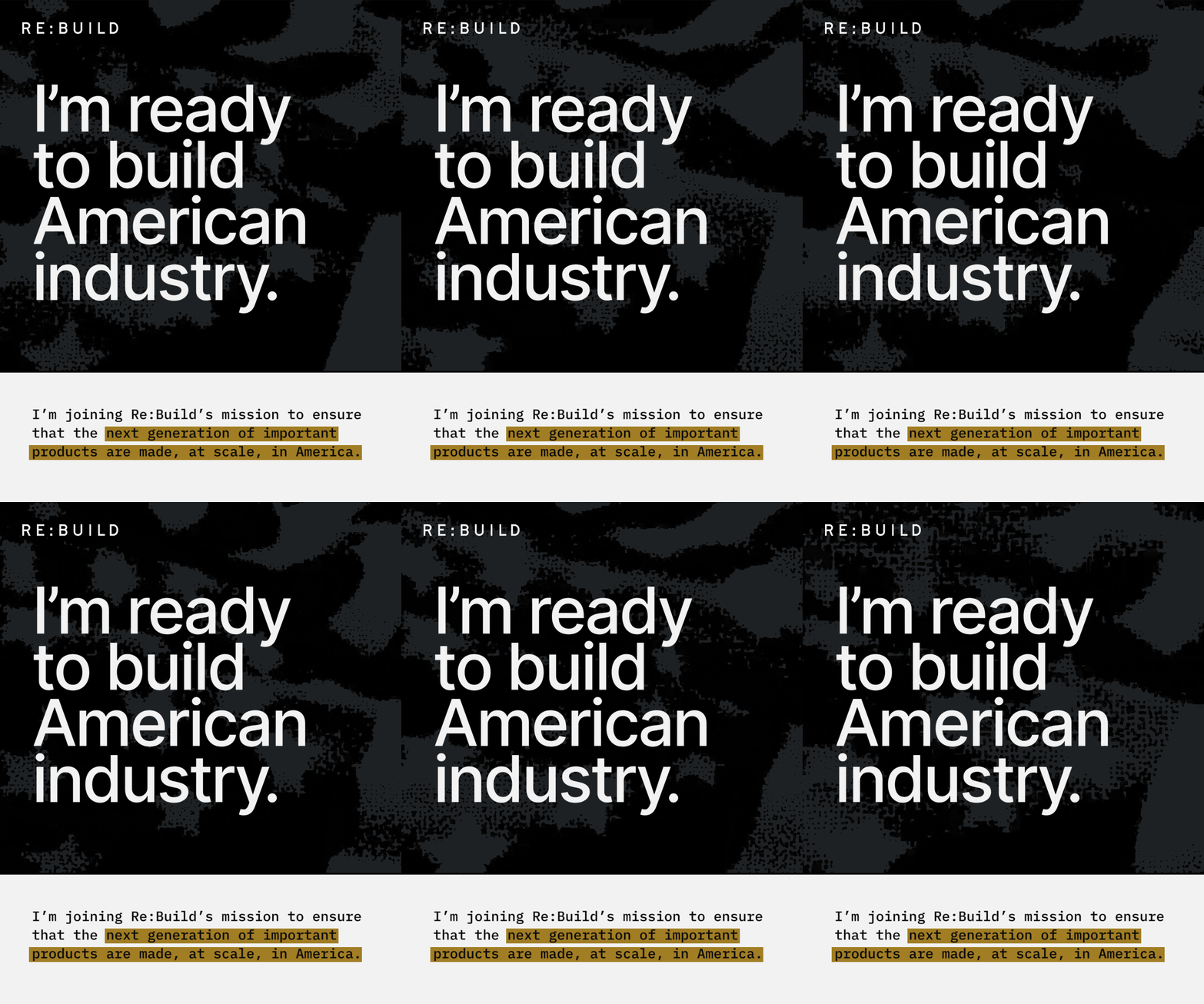
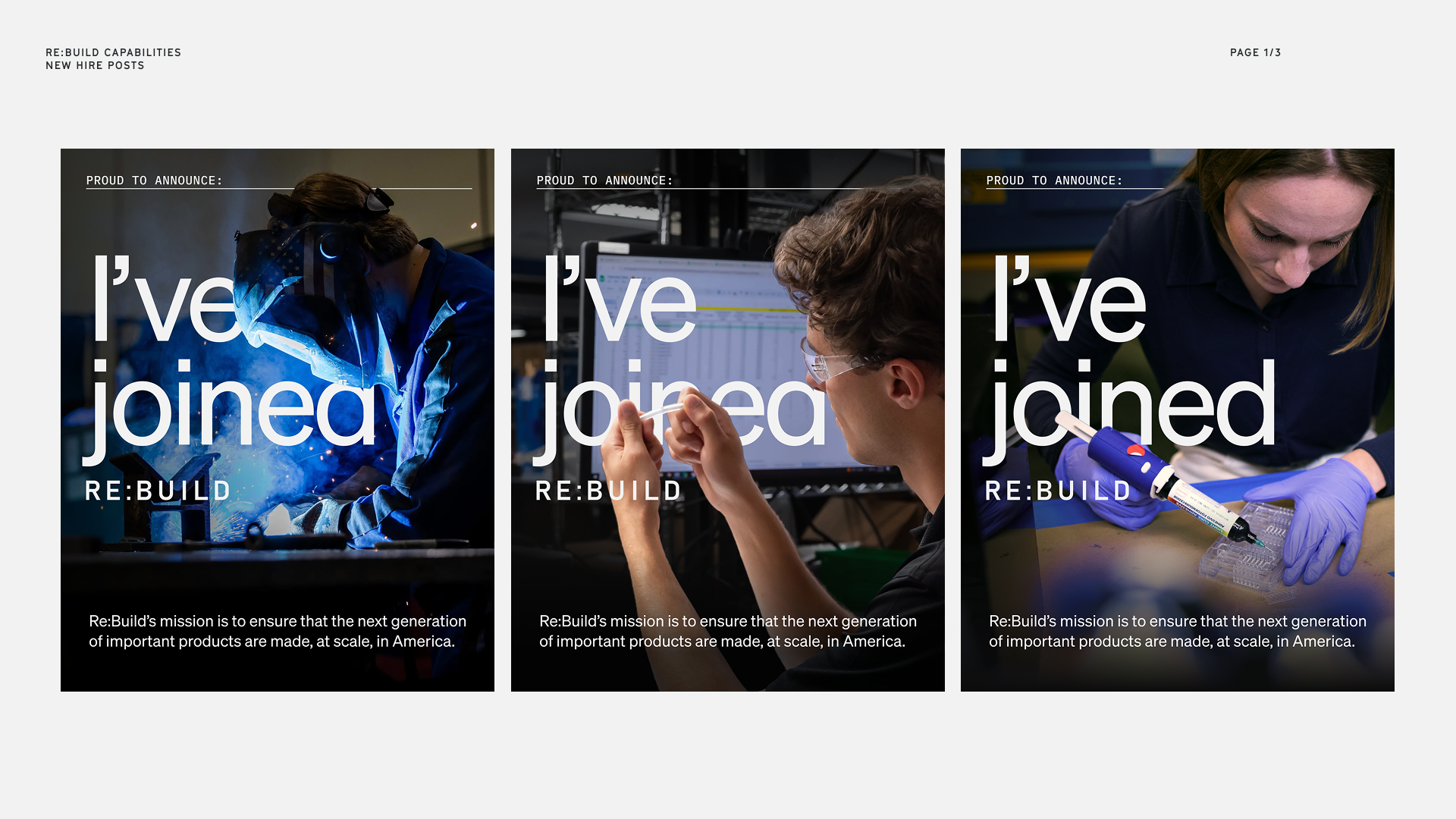
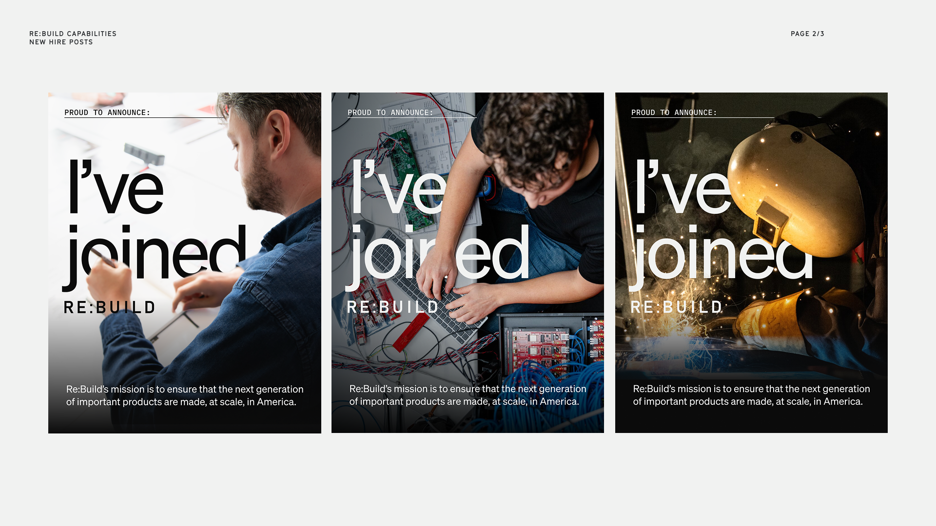
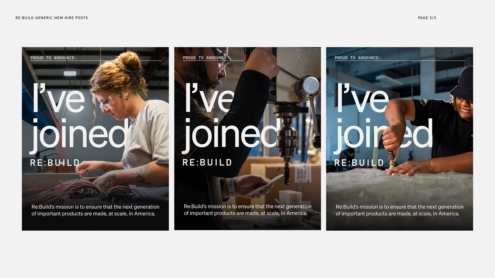
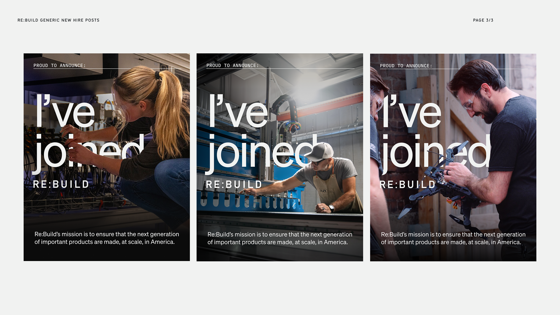
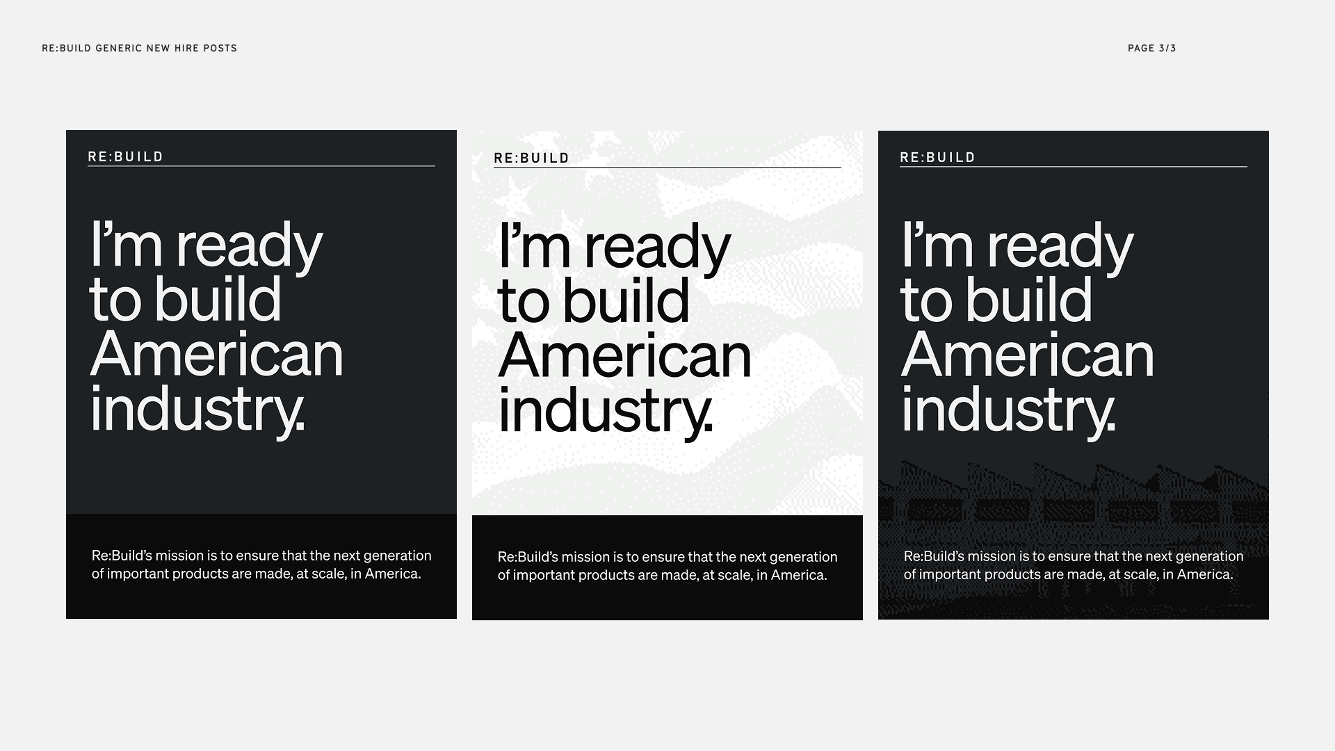
These graphics are meant to be sent to new hires or employees as a welcome kit. With this image, they can choose a graphic to post as a celebration of their new beginning. Like the others, it was important that it was generic enough so that it could be posted by any new hire. To accomplish that, I focused on close cropped images that hid faces. I also included the company's mission statement to give some context to viewers who were hearing of Re:Build for the first time.
Animations
These are a few animations that I created using Figma motion. Much of the animations are subtle but it was important that the motion grabbed the attention of viewers without taking away from the text/purpose of the graphic.